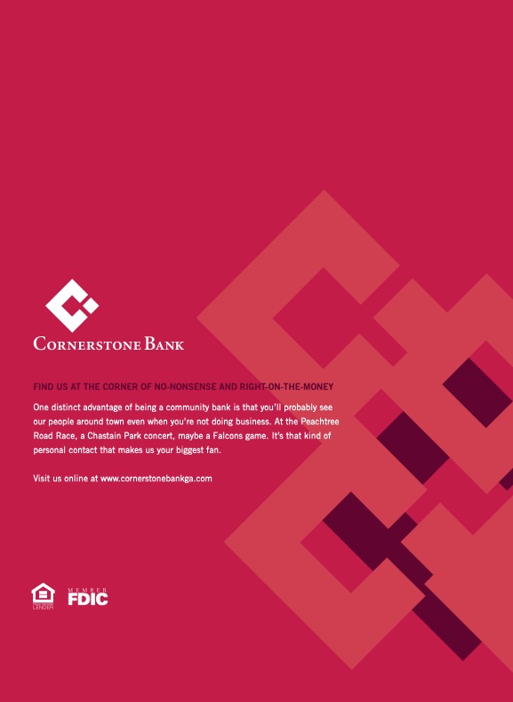
Let’s face it: one of the most conservative brand categories out there is banking. It can be a sea of beige, white, and navy blue often paired with worn-out verbiage. So when this nimble community bank asked how they might stand out, I resolved with a crackerjack team of designers and marketing pros to take them way off the beaten-and-boring path. We splashed out with vibrant colors, energetic photos, and unexpected words like “fanatic”, “unflinching”, and “head-over-heels devoted” to make sure this brand was memorable in a crowded marketplace.


